3D Flip Card Effect with HTML and CSS | Step-by-Step Guide 🔄✨
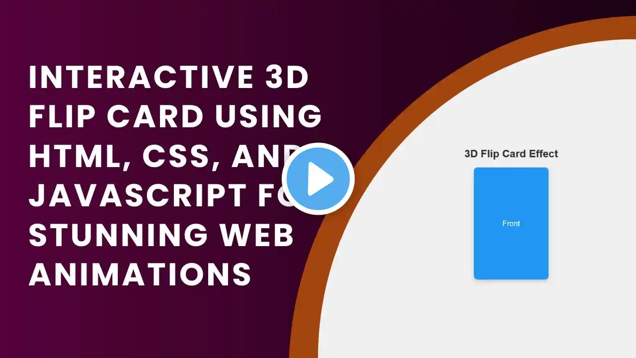
In this tutorial, you'll learn how to create a stunning 3D flip card effect using HTML and CSS. This simple guide will walk you through building an interactive card that flips 180 degrees on hover, revealing its backside. Perfect for adding dynamic, eye-catching content to your website! 🌐🎴 What you'll learn: ✅ How to structure the flip card using HTML 🖥️ ✅ Styling the card with CSS for a clean, modern design 🎨 ✅ Adding 3D flip animation effects with CSS transitions and transforms 🔄 ✅ Customizing colors, fonts, and borders for a personalized look 🎯 ✅ Creating a fully interactive card without JavaScript 🛠️ By the end of this tutorial, you'll have a stylish, interactive 3D flip card that enhances your website’s visual appeal. Don't forget to like 👍, subscribe 🔔, and stay tuned for more web design tutorials! 🎥🚀 #HTML #CSS #WebDesign #FlipCard #WebDevelopment #Tutorial #FrontendDevelopment #InteractiveDesign #Animation #WebDesignInspiration 🎉 Code Repository: Access the complete source code on GitHub: https://github.com/madrasacdemy/htmlc... If you enjoyed this video, don’t forget to like, comment, and subscribe to Madras Academy for more exciting web development tutorials! 🚀